
Quote and buy

Year: 2017
Team: Myself (UX Designer), Head of Customer Experience, E-commerce Manager, Senior E-commerce Executive, Business Analyst, Project Manager, Test team, Front and back-end developers and Web Analyst.
My role: User research, competitive analysis, persona creation, user testing, low-mid fidelity prototypes, visual design, stakeholder management and CSS Troubleshooting.
The project goal was to redesign the existing quote and buy journey to increase conversion rates especially on mobile devices.
Discovery Phase
1st Central's mobile traffic was looking to surpass desktop in 2017 and with mobile conversion lower than desktop it was decided a redesign of the existing quote and buy journey was required adopting a mobile 1st approach.
the team
Discovery Phase
The data
The data that clearly showed that the share of site visits for mobile was soon to catch up an suppose desktop in the early part of 2017. With an increase of conversion to 30% for mobile we would see an increase in revenue of £1.2m.

2016 conversion and site visits
Competitive analysis
I researched our direct competitors quote and buy journey and.
USER RESEARCH
I conducted user research on our existing mobile journey. I helped facilitate several sessions in session cam with our web analyst and also see some user testing on user tesing.com. I wanted to understand the user pain points and frustrations with using the existing mobile site. These were:
- Buttons are difficult to select
- Can only see the annual price
- Long, scrolling page
- Too much info to read and fill in
- Limited support functionality
- Some boxes aren't very clear

Our four key persona groups
After reviewing each session and the results for our user testing I made the following suggestions for the journey:
- Prominent display of annual and monthly price
- Price display that follows you and updates
- Shorter pages
- Less clutter
- Consistent CTA’s
- Use colour blue for help buttons
CONTEXTUAL INQUIRY
As a team we conducted a field trip to the Science museum looking to conduct a contextual inquiry on the museum whilst also interviewing people from our four main persona groups.
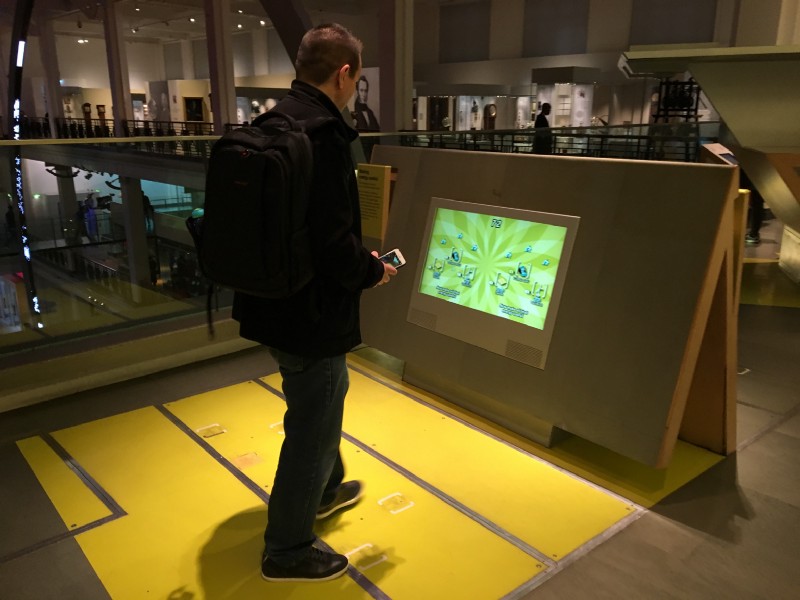
Science Museum on site research
The Problem
Due to the large size of the museum visitors can get lost and miss seeing all the items that interest them. As certain exhibitions are very popular crowds and bottle necks can occur wasting visitors time which can their enjoyment of the museum.
The Solution
To provide an app that which allows visitors to successfully plan museum visit seeing as much as possible within their allocated time frame whilst avoiding the crowds.
Defining the Problem
Affinity mapping
We then collated the information from our user research and created an affinity map which helped us compile our findings from our multiple interviews and spot trends.
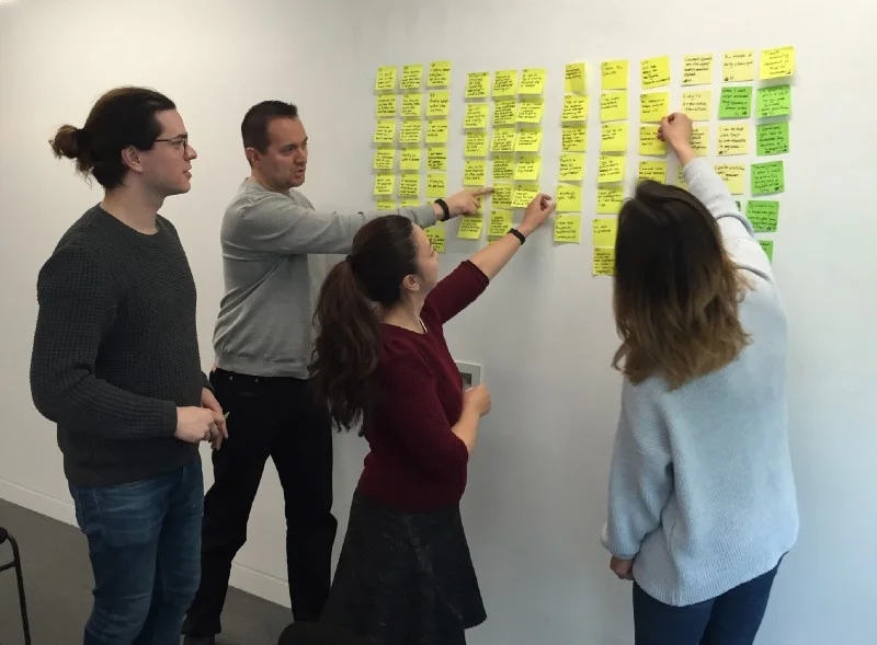
Affinity mapping

Affinity map findings
The key points we pulled out were:
Experience: From learning new information to being able to interact and immerse yourself in an exhibit.
Navigation: A big frustration with our users was being able to navigate around the museum. Many get lost easily, don’t like the big crowds and would like to know how long they should spend in each exhibit.
Purpose: Why the users go to museums: Family outings, a day of escape, their Interests and Visiting a new country.
Planning: There is a mixture of those who like to plan ahead of their visit and book exhibitions early and those who go to the museum on a whim.

Persona Creation
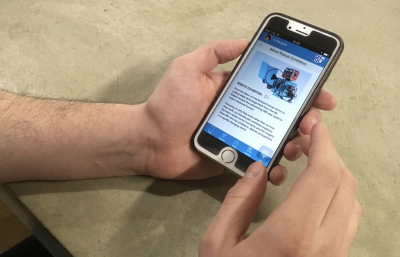
Through our user research we were able to create some proto personas, individually we created different scenarios for each of our personas. We decided to focus on our main persona of Margrite who is a married mother of two children who is also a tourist in London wishing to spend a limited amount of time in the science museum.

Margrite — our main persona
EXPERIENCE MAPPING
Using our main persona of Margrite we began to create scenarios and user experience maps to help us understand potential pain points for our persona.
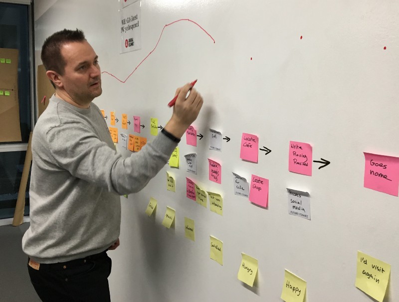
Creating the experience map for our main persona
Scenario: Margrite has planned to go to the Science Museum with her family, she only has two hours to see as much as possible and visit an exhibition.

Margrites experience map based on our main scenario
Feature Prioritisation
From our findings we used the MOSCOW method to figure out which features to build on. As one of the biggest frustrations our user has is being able to navigate around the museum, this was a big focus for us. So the MUSTS for us were:
To have an interactive map, that uses geolocation to help them navigate. There would also be time suggestions on how long to spend in each exhibit and alerts to tell the user how busy an exhibit is. We also wanted to incorporate a “fun” element in to the app as it is an important aspect to both the brand and user. And finally the ability to have filtering options to choose which exhibits they want to see.

Planning feature prioritization using the MOSCOW method

- An interactive map that uses geolocation to help users navigate
- Time suggestions on each exhibit so that users know how long to spend in an exhibit.
- Alerts to let users know how busy exhibits are
- Filtering options so users can pick the exhibits they want to see
- Fun and interactive elements
Developing the Solution
DESIGN STUDIO
Once we had decided on the features that we would have on our app we started sketching out ideas of how how we would design those features. This was done in a design studio exercise where we rapidly sketched our ideas based on some scenarios for our main persona Margrite

Our first design studio
In the first session we sketched around the problem the user problem:
How can Magritte find her way around the exhibits with her children, and maximise her time in the museum? She has just a few hours.
In the second session we sketched around the problem:
How can Magritte find the information she needs to make sure she and her family sees everything the museum has to offer, when her children can’t read English very well? She has a full day.
After that we digested and synthesised the best ideas that would work together as a whole for both problem 1 and then again for problem 2.

Initial sketches from design studio
We then looked again at both problem and discussed which problem would be of greater value to the user and the client, as well as keeping the overall client brief in mind. The consensus was to move forward with the sketched from problem 1 into a paper prototype.
Prototypes and user testing
We then started to design our paper prototypes and test them with users. We initially started with paper, then moved onto a clickable paper prototype. The testing introduced some interesting results which causes us to changes the design of the pages after each round of testing.

Paper prototype testing
The sketches were redrawn for mobile and then placed into Marvel.As a team, we tested with users and recorded the findings. The key findings were highlighted and these were used as part of the iteration process.

Clickable paper prototype in Marvel
Some of the findings we found from testing the paper prototypes were: users were going to search bar to search for exhibits - we hadn’t incorporated this functionality in the prototype. It wasn’t clear how the user selected their agenda and planned their day. Users got stuck on certain pages. The burger menu was unneeded as only one option within it and the overall journey not clear.
WIREFRAMES
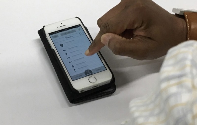
Clickable wireframe prototype
We incorporated our findings from the paper prototype into a clickable wireframe created in Sketch and in linked into Invision. We then run a second set of user testing on the wireframes, our finding were; Add walking distances to the map, add heat map to the floorplan, make agenda editable, make the book exhibition more prominent change some of the call to actions to be more friendly and remove search bar.
MID-FIDELITY PROTOTYPES
We then took the findings from our user testing on the wireframe prototypes and added them to our mid fidelity prototype, we then conducted further user testing to finalise our design and move into a high fidelity prototype.
Mid fidelity prototype
DESIGN ITERATIONS THROUGH TESTING


Homepage
On the homepage, our users found it confusing that we had both a global navigation at the bottom of the page as well as a burger menu. Therefore, we decided to bring more options on to the navigation and remove the burger menu. On the second iteration we also decided to make the search bar more prominent, however in the final iteration, this was removed as users weren’t interacting with it.
Agenda set up page
When presented with this page, users were unsure what was being asked of them. We therefore added “select activities” at the top of the page. As our persona had already booked to see the Robots exhibition, we wanted this to be pre-selected on the agenda, however we discovered that this wasn’t very clear so we decided to separate it out from the rest of the activities and make it more prominent.
Agenda page
On testing the agenda page, we found that the users didn’t realise that they needed to set how much time they had. We decided to remove this and bring it earlier in the journey (you can see it in the high-fidelity wireframes for the filter page). We also found that users didn’t like to be restricted to the times set by the app, so in the last iteration, we added an edit button to allow users to amend timings and also rearrange the order of exhibits.
Map
The map initially started as almost 3D, but users wanted to be able to see where they were in relation to their destination. So in our low-fidelity wireframes we made more of a flat aerial view, showing both where the user is and where they are going. Finally, in our high-fidelity wireframes, we made it clearer how long it would take to get to the destination, as well as how busy the exhibit was.
Delivering the Solution
Clickable prototype
The below prototype takes you from the initial personalised email through to setting up your account and then moving onto the timeline which explains the care process and the what happen next.
Contact me
If you have any projects or would just like a chat contact me on the below form